Tuesday 14 April 2015

Battle of the Matte Lipsticks: Nars vs. Inglot

So you remember that lipstick I bought while my husband went on a rampage in a toy store? I'm going to do a pretty comprehensive review and  comparison of that and another one in this post.

First, let me present the contestants and the Judge of this battle!
Inglot AMC Lip Pencil vs. Nars Pure Matte Lipstick with Judge Sirotan Pirate Henchman. (and my amazing skill at standing him up on his tail for this photo!)
Since I can't somehow insert a table to compare them side by side, we will just start with the short one. Some info about my lips: they are very dry and I bite and lick them a lot. I'm lazy so I don't re-apply much. This makes me a very harsh lipstick critic! ;)

Nars Pure Matte Lipstick

Colour: Bangkok (soft rose)
Thoughts: It is a muted nude pink with gold shimmer, so I don't know how it's classified as matte when the finish has a soft sheen to it?! It is not that pigmented actually, a little on the sheer side for a matte lipstick, so it needs a few swipes for full coverage. I just really like this colour, that's all.

Formula (from their website) : Contains wild mango butter for moisturising properties, long-wear applications, vitamin E and acai oil for antioxidant benefits.
Thoughts: There is no such thing as long-lasting moisturising lipstick, just does not happen with chemistry or physics! It is moisturising, it looks even when applied but actually feels a little gritty for my lips. It doesn't dry my lips out any more than they dry themselves out, lol. It's nowhere close to as long-lasting as the Maybelline one I reviewed last time, there will be no trace of it after lunch and coffee...

Price: $35 for 2 g from Mecca, so on the more expensive end for those with a budget.

Inglot AMC Lip Pencil 

Colour: No. 24
Thoughts: It is a dusty rose pink, and definitely a matte finish. It looks warmer with an orange undertone on the back of the hand and in the tube, but appears to have a neutral-cool tone when applied. It is quite pigmented and looks pretty pink on my lips.

Formula: Not much info on their website, except for avocado oil for a moisturising, long-lasting effect.
Thoughts: Compared to the Nars lipstick, this one is not very moisturising. It is essentially a fat lip pencil, it still sits in the lines of the lips a bit but the application is much smoother. Again, nothing is as long-lasting as my Maybelline one, but this one is pretty good. It fades pretty evenly after lunch and dinner, and the lips look a little stained. The only downside is dryness I guess...

Price: $23 for 1.8 g from Inglot stall, not bad if you don't sharpen and waste it too much. Yes, it comes with a convenient sharpener on the end of the tube.

Pictures time!
Lippies out of the tubes, and Sirotan needed a rest from his previous magical acrobatic stunt!
Swatched on the underside of my forearm, Nars on top and Inglot on the bottom.
Top: Indoor fluorescent light (everything looks yellow! >.<) 
Bottom: left - natural outdoor light (cloudy), right - stain after rubbing off with tissue.

On the lips, Nars on the left and Inglot on the right. The lighting is slightly different but both under natural indoor light.
Inglot still had plenty left after food, but the dryness?! You ask where's Nars? All in my stomach with the food and drinks!

The left-over Inglot lips looked fine from far away, and I really hate the yellow undertone from the fluorescent light! Sirotan and I think Inglot is the winner of this battle, since dryness can be solved by some lip balm, but the lack of lipstick is the end! :p

Procrastination Update: All the cute things!

This post is to make up for the previously failed "Lipstick Week" post, I only lasted 4 days of lipstick in that week...

I'll start my redemption by posting the Scottish cousin of Boris the Wolf; say hello to Hadrig the Fox!
He is based on the same crochet pattern as Boris, with larger ears and additional whiskers, and of course, orange in colour.
 Hanging (like my pun?) with Kurosuke (Studio Ghibli Sootball) as the guardians of the TV. 

Hope you're ready for more "Awwwwwww"s! This is what happens when you led your husband off the leash while you're trying to buy a lipstick... The review of this amazing lipstick can be found here.
Deadpool and Groot Bobble Heads <3
Being a die-hard Deadpool fan, hubby just had to buy him to go with our Deadpool Smorking Labbit (yes, that is the correct spelling of this brand of toys). At least the colours of these two match, they both have red and black...

Anyway, these should be enough for your daily "Awwww" dosage, if not, here's a link to more on Reddit. :p

Finally, a celebratory photo of my Ph.D graduation! ^^ Think it still counts as an "Awwww"moment.
Just some extra information that no one else cares about; The University of Sydney DOES NOT have a floppy Ph.D hat! So the only way to tell you apart from dodgy undergrads is the colour of the red hood, I got totally shafted! :( Can you see how the colour scheme of this post has translated throughout? The colour of foxes is called red, even though it is clearly not red, and Kurosuke is black, duh!

Monday 23 March 2015

Lipstick Week: Swatch and Review (Monday)

I am determined to wear a different coloured lipstick for each day of this week, just to annoy my husband because I can.

Apparently a lot of guys don't like kissing girls with lipstick on, I can imagine the reasons but I don't think it's enough to deter girls from wearing them. So suck it up, boys!

For each of the lipstick, I'll do a short review and some of my signature blah blah blahs. Lipstick is one of those really annoying make up items that differs heavily on personal basis, more so than other make up. I have put in a close up of my bare lips and a full mug shot (no make up other than lipstick) for skin tone reference. I try to take photos under the same lighting (bathroom selfie time, lol), so direct comparison can be drawn between the swatches. 

Monday

Maybelline - Super Stay 14Hr Lipstick in Enduring Ruby (#070)


Left: bare lips, Right: Two swipes and lined 

Indoor natural lighting without flash on a relatively sunny day.

  • Shade: A cool toned, bright, berry red (colour does not deviate on lips), Satin finish. 
  • Formula: Smooth application (glides on easily), moisturising, does not accentuate dryness (not settle in lines), highly pigmented, not sticky, minimal feathering, can easily re-apply, nice berry smell.
  • Staying power: slight initial transfer, long lasting (probably can last up to 14 hours), fades evenly, stains lips. 
  • Price: Cheap enough = plain packaging, decent quantity (3.3 g)
Left: blotted on tissue for a more matte finish, Right: After drinks, snacks, dinner (Garlic prawns & gnocchi in Arrabiata sauce), fruits, and some gentle smooching with the hubby. ;)

Final verdict: Probably the best drug store lipstick that actually does what is advertised. I know that dark colours will always have better staying power than light/nude colours. That aside, the lack of transfer makes it better than some high-end designer lipsticks, that's a big deciding factor for me. I have tried Giogio Armani Lip Maestro in 400, the amount of lipstick that I vigorously wiped off without affecting the colour on the lips both amazes and scares me... Anyway, can't think of any more to write and being kicked off the computer, Ciao! xo

Crochet Project: Boris The Wolf

This month's obligatory post is another craft related entry, but the end result this time is much Cuter! This little cutie was requested by a friend for her work related agenda, and she purchased the pattern on Etsy from this extremely creative seller. I'm very please to let you know that this post is going to be short and sweet, unlike the previous wishy washy essay-like posts. =P

I have made some variations to the final product, but the crochet pattern remained the same.
Sitting on the scratching post, invading the cat's territory!
The most obvious difference is the colour scheme; I used white, light grey and black for a less intimidating appearance (imo anyway) instead of the original colour choices.
Awwwwww!! Too cute not to be squished!
Oh the googly eyes! Bigger eyes always make things look cuter, or alien-like if they get tooooo big. This is natural selection at its best! #notbabycrazy
Auditioning for Saturday Night Fever with just the right amount of Boogie!
You think the ears look too small? Wolves actually don't have huge, stand up ears like German shepherds! Maybe the big, bad wolf in the Little Red Riding Hood, but this baby definitely doesn't need them!
Oh yeah, his head is also slightly crooked... Well adds to the derpiness, I guess?

Just to babble on like I always do, I absolutely adore wolves! They are my favourite animal and majestic as fuck! I would even move to Alaska or Canada just to be near them. Of course, they are no pets and wild at heart, but it'd be nice to have a wolf-dog hybrid as a pet. There aren't many documentaries or books on the interactions between human and wolves, but the ones out there are definitely heart-warming and soul touching. Here's a National Geographic article on A Wolf Named Romeo for a different view on this beautiful animal.

Obligatory cat photos nevertheless, don't think the cats liked their limelight taken away from them!
Ossi's "Don't Give A Fuck!" face and trying to push Boris off his pedestal.
Here's a wolf on a cat on a computer chair! Where am I suppose to sit?

Thursday 26 February 2015

DIY Project: Making a Solander Box

Apparently, if you keep doing something at least 5 times it becomes a habit (one of those lame madeup philosophies by my husband). This means, after I've published this post I'm done for the rest of the year as a blogger, right?! :P Just kidding, I actually enjoy posting, I just tend to procrastinate more.

This project was on my mind since late last year as I wanted to buy a nice presentation box for our wedding album, which had been sitting in a plastic bag vertically since we got it. Naturally, the cover became slightly bent... so I decided to get a box for it. Due to my anal retentiveness, it was just impossible to buy the perfect box without spending a lot of money for a custom made one. A lot of places I found only do wholesale, while this Etsy store provides bespoke and personalised boxes, the choices are very limited.

Since I'm pretty good with making things, (lol no shame!), I decided to do it myself and make exactly what I want in the box. With the help of youtube and some particularly helpful videos but this professional bookbinder, I embarked upon the journey of box making... 

First of all, I'd like to make my own differentiation between the Solander and the Clamshell boxes. According to wiki, the only difference is in the language used, i.e. British vs American. Apologies but I HAVE to sidetrack for one thing here, because the reference for that wiki page was taken from my friend's father, Australian historian Edward Duyker. Graham and I are still amazed by his personal library, and his collection of historical artefacts and geological samples!

Back to boxes, from what I've seen across the internet, most (with some exceptions of course) of the Solander boxes have three fixed side sections on both the top and bottom trays. While most of the Clamshell boxes on the market have only fixed sides on the bottom tray and a flexible lip for closure. Since the Society of American Archivist glossary has defined both boxes with three fixed sides on both base and lid, I truly don't understand when, where and how this "sideless-lid box" came about. I imagine the box without fixed sides on box trays is probably less sturdy and light-fast for archival purposes. I also realised that I put too much information regarding my post subjects, but I hope this can help you make some educated decisions if you ever want to buy or make a box yourself. Anyway, I'm calling it a Solander box to honour the person who invented it!

FINALLY, a photo-guided tour of this box-making process. If you've watched all six of Sage's videos and followed his instructions, without coming up with some smart-arsed alternatives like I did, then you'll probably be fine. Since I hadn't completely thought through my ideas, what you'll read about instead is a bunch of stuff ups I made and I how fixed them. :P
*In reality, I write all this crap and then upload the photos and add some final touch ups. The photo processing part is extremely brain numbing, so I had some Carpenters playing in the background to help the mood a little. You know, imagining little birds singing in the garden outside the kitchen window, but they're really taunting the cats that are stalking their every move on the inside. So close, yet so far, damn you birds!!

Part 1: Making of the Bottom and Top three sided Trays. 

This was where all things went wrong because of my little self-justified idea (backed up by husband) to replace the starting material with MDF Wood (3 mm thickness). So here is a list of advices for How Not To Fuck Up!

No.1: DO NOT USE WOOD!!! Unless you have power tools.
Just stick with cardboard, bookbinding board to be precise. Other than being more sturdy and durable, it's really not workable unless you have power tools! I was able to get help from some generous friends who pretty much did most of the cutting and sanding for me, otherwise I would've given up a while ago.

This is what happens when you don't have power tools:
Despite your effort of making precise drawings for cutting, that hand saw you bought just for this purpose will just lay all that effort to waste in the form of the teeth marks of a wild rabid dog! You then have to mask that inexperience of using a hand tool with copious sanding and some sort of terminal lung disease from inhaling all the saw dust that the wind just blew into your face! All this can be solved in less than a minute on a fucking table saw! Hell Yes to power tools! I was raging so hard during this part of the process, and promised myself I'll never work with wood again, unless I get my own power tools one day... 
Not all tools are present here, if you haven't chosen to use wood then you wouldn't need a saw!!

No. 2: DO NOT USE WOOD GLUEIf you have ignored my first warning...
Wood glue is just your regular PVA craft glue but higher quality, which is still completely useless if you're trying to stick three long and thin pieces of wood together while trying to retain structural rigidity! Fuck that and go straight to the hardcore 2 part epoxy that sets in 5 minutes! It creates strong permanent bonds in no time and requires minimal clamping. Don't get the 90 second ones as it'll just solidify as you apply it onto the wood, while the 2 hr ones are no different to the wood glue. I'd rather go for the over kill than waiting around hoping the wood glue has dried over 24 hours and find out that it breaks as soon as your cats inevitably sit in the cat trap you've painstaking crafted.

No. 3: LEAVE ROOM FOR MISTAKES!
Most of this really came from working with wood and the bad cutting job from the hand saw. The bottom tray was cut by hand and the top by the table saw, but the fit was just too tight for the covering fabric I bought. Lucky I made everything a little bigger so that I could sand the crap out of the bottom (inner) tray to give it more room for the fabric. This was also done with the help of my friend's table mounted belt sander! It also fixes the remnant glue marks and that imperfect gluing job you did. Mistakes are okay, if you can fix them. If you can't, then you're just fucked and should start from scratch and try not repeat them again! Of course, there is no room for fuck ups when it comes to important things, I certainly hope that making a box is not THAT important to you...
The top tray is supposed to be 5 mm lager than the bottom tray on all 3 sides. Think it looks ok? Think again!
When you fit them together, BAMMM! You've screwed up somewhere, somehow...
Okay, no more swearing from here on! Angry kitty is gone, happy kitty is back! =^_^=

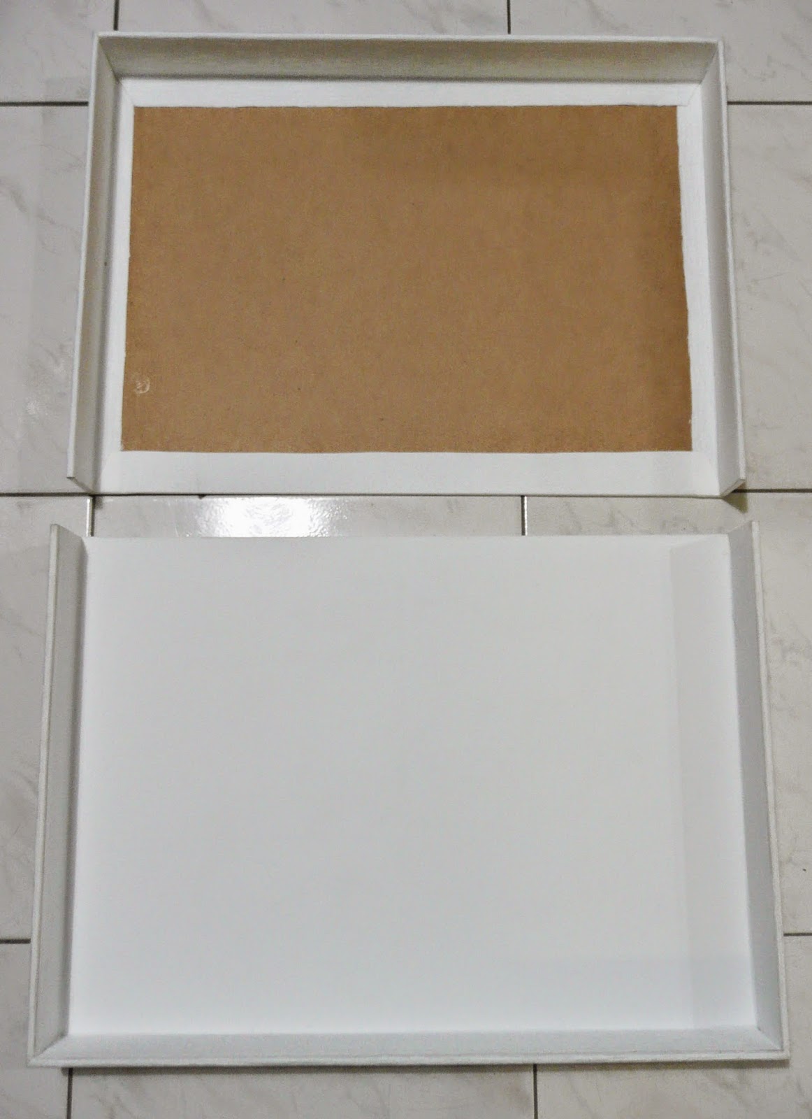
Part 2: Covering the Trays and the Cover with Fabric.

The cover is made from three separated pieces of card board (slightly larger than the trays after they've been covered) held together with the fabric, so that when glued onto the trays it creates a flexible drop-down spine. My local Eckersley's store didn't have the bookbinding board in stock, so I bought the core boxboard instead. Since I'm sticking it onto wood, rigidity is not an issue here. If you're using it for making the trays, please don't use boxboard as it will bend when you apply glue onto it. Anyway, just make sure you leave enough room between the pieces or it won't fold over properly. Yes, this is another one of my minor boo-boos, but it was easily fixed by cutting a little off the edges of each piece of board.

Here's another little trick I came up with for this project and future fabric-covering related projects. The most common fabric of choice for bookbinders and box makers is Buckram. I personally find this extremely boring and hard to find in our crappy local fabric stores (namely Lincraft). Another alternative to this to find some nice fabric and iron on some adhesive backing to make any fabric suitable for gluing. OR, you can just buy some nice curtain material and your work is done. This is probably the only thing I did right for this project! 

The bottom tray was left unlined, since I was going to add a padded layer to it anyway. And again, leave some bloody room for mistakes! Can you also see the gentle curvature of the bent boxboard?
And some illustrated guide for covering and wrapping around the corners of thick pieces of boards. Or you can just watch the youtube videos...
The fabric I bought for the cover was quite thick and stiff and nicely textured, it is off-white with a soft satin sheen, which is perfect for a wedding album box. I used a thinner plain fabric for lining the inside. The great thing with curtain fabric is that they don't shrink when you apply the glue, or need to be pre-washed for the iron-on backing. However, you'll need to press the thicker fabric to the wood for at least 30 minutes with some weights to ensure proper bonding. Yes, you can use wood glue for everything here, no need for fabric glue, which is for gluing two porous surfaces together.
There's a trick to wrapping around corners and that, but due to my inexperience, my corners turned out to be a little bit ugly. Other than that and the whole process being time consuming (mostly waiting for things to dry), it went pretty smoothly. 

Part 3: Assembly & Final Product.

The most important thing is to have some even heavy weights for pressing. Due to the size of my box (11" x 14"), it was really hard to even find books that will fit into the box properly. Since the boards were slightly bent from the wet glue, you really have to press hard around the edges and apply extra glue in the gaps. We managed to finally glue everything together with the help of my husband's collections of somewhat useless nerdy things (mostly MTG cards).
Magic cards are actually the major contributor to the overall weight, and Lego by volume. At least I know that my box can withstand some heavy squashing!
The final touches are the extra spine board that fits within the gap of the two trays for extra light-fastness, and the padded minky fleece lining for the bottom tray. Most commercial boxes don't have either or both of these extras, hence justifying the DIY business. The lining is the only part where you'll need fabric glue and some double-sided tape, at least no excessive pressing is needed! :)
Soft and fluffy just like my cats! <3 
Dun dun dun "drum roll", here are some obligatory photos of the finished product. I'm pretty satisfied with the final product, regardless of the tedious making process and some minor imperfections, and that the texture of the cover makes it hard to open and close the box. I means seriously, when is friction ever a good thing?! Also it's for storage, so unless some troll friends of ours request to look at our wedding album every time they come over, it's not really a problem. :P


Hope you had more fun reading about the mishaps of my box making adventure than I did making this pretty and useful piece of crap! I'm proud of it, but it was really a pain in the arse, and it was ALL MY FAULT! Sigh...~_~"

Friday 30 January 2015

Nail Polish Collection Part 2


To tell the truth, posting about nail polishes is really no fun compared to doing my nails or buying polishes. Who would've thought?! Duh!! However, I was forbidden to buy a few new ones I've set my eyes on until I posted this one, so here I am. :P 

Meanwhile, I've been spending a lot of time ogling at sexy the Joestar family members for my next art project, specifically Jonathan, Joseph and Jotaro. They are from my favourite manga (now made into anime), JoJo's Bizarre Adventure, and are the men of my dreams! ~Swoooooon & Drooooool~ They are super tall (all above 195 cm), super shredded (massive and crazy muscle definition), pretty funny, always able to turn things around when in a pinch, and just absolutely fabulously sexy! If you're interested in my artworks, please come back for them when they're done. I've side tracked way too much here, so I'll get straight into the photos of the rest of my polishes.

Part 2: Non-colour shifting Polishes
This category includes everything that doesn't contain colour-shifting components, which is everything else that you can think of. I don't have a lot of special effect polishes, such as magnetic, soft/velvet finish, sand/sugar finish, and etc., so you won't be seeing any here. Solar and Thermo-active polishes don't really belong to my two categories, they change from one solid colour to another solid colour upon exposure to UV and temperature changes. As I mentioned before, they are chemically and physically different to the optical colour-shifting materials in the previous post, and since I don't have any, I'm not going to worry about them. 

Brand acronyms (recap):
AE - A England
CC - Color Club
CG - China Glaze
DD - Different Dimensions
EL - Estee Lauder
FF - Femme Fetale (Polish)
HP - Hit Polish
LSL - Liquid Sky Lacqure
PP - Picture Polish

1. Smooth Metallics
Needless to say, these polishes have a metallic shine to the finish, which contain a mixture of metal pigments and mica (they are not the same). The silver metallic colour usually comes from Aluminium powder, while Titanium oxide and mica (Silicate) give a pearlescent shine. Due to the low metal content, the finish of the metallic polishes will never be the same as a piece of polished metal, but resembles more of a mineral ore. 
This is when I'd like to emphasize the difference between metallic and chrome finishes. As you can tell from its name, the conventional Chrome finish requires plating of the Chromium metal onto a surface to create a smooth mirror-like surface. This is unachievable for nail polishes as chroming is a chemical process and has health and environmental issues. Therefore, all the so-called *chrome* polishes are not true chrome because they can't reproduce a perfect reflective mirror finish. If you want the REAL chrome effect, go with stickers or acrylics. The closest to a true mirror finish is probably the Layla Mirror Effect polishes. It's still very hard to achieve a smooth finish with these polishes. You'll need to really prep your nails and use a good smoothing base coat. The polishes also tend to drag, so additional coats and top coats are probably desirable if you're not skilled.

AE - Perceval, Chanel - Taboo, EL - Chrome Violet, Chanel - Bel Argus, Australis - Bun of Steel, OPI - Moonraker, Layla - Mirror Effect Metal Chrome, OPI - Birthday Babe, and EL - Brushed Gold.
Kitties26 of More Nail Polish has a very informative blog entry on this, if you'd like some visual assistant to my explanation. Now that is a TRUE nail polish blog, compared to my mishmash of random things.
One more thing, Chanel Taboo isn't really metallic, but has copper/gold metallic flakes. Bel Argus is weird, it has a blue to purple colour-shift but is definitely more metallic than the plain colour-shifting polishes, yet the pigment is fine unlike the colour-shifting metal flakes. They're in the metallic just because they're fancy but whatever.

2. Mesh Metallics
Correct me if I'm wrong, I think Picture Polish is probably the first who coined this term for their range of nail polishes. I also think it's a rather accurate description for the appearance, which consists a relatively homogeneous mix of two or more fine metallic glitter (or flakes) suspended in a tinted base. The ones I bought have a smooth finish, but some can dry to a gritty texture, so a nice thick top coat would help. I have added some 0.008" gold and holo gold glitters to Glitzerland; therefore, giving it a more mesh-like finish. I like my version way better! <3
OPI - Glitzerland*, AE - Excalibur (new), Arezia (Sasa HK) - 3rd to last.
The polishes I bought from my HK trip don't have any names because they are cheap and generic, they were less than 1 AUD for a mini 5 mL bottle! :D Haven't worn them yet, but the colour payoff and the formula are not too shabby.

3. Holographics
Or I call it, Rainbow Wonderland! I absolutely love love love these, not just because how shiny and colourful they are, but also the complex chemistry and physics behind it all! I mean light wavefront interference and diffraction, short wavelength X-ray lasers, synchrotrons, metalised PET (polyethylene terephthalate), phase and amplitude modulations are probably scientific terminology you either have never heard of or are just uninterested in, but I thrive on these theories and ideas and fancy equipment, and probably lived with (and for!) during the Ph.D years...
Getting too excited here, lol, all I'm going to say that makes more sense here is that you have two types of final visual effects: linear and scattered. For example, in Futuristica and 2NITE, the glitters are different in size but they all reflect and refract light in the same direction; hence, appearing as one big rainbow. The Oztoic chrome shatters and the OPI designer series (DS) are examples of the scattered effects, where the holographic particles are irregular in size and the light bounces off in all different directions. 
Most linear effect holographic polishes are made with SpectraFlair® pigment, which is an industraial trademark material. The particle sizes (14, 20 and 35 microns) are much smaller than the finest holographic metal flakes (50 microns, or 1/500"). You can still create a linear-ish finish with the metal flakes, it just won't be as smooth and satin-like as the SpectraFlair®, which is expensive and hard to source.
CG - FYI, CC - Harp On It, DD - Black Dahlia, FNUG - Futuristica, CG - 2NITE, Ozotic - Chrome Shatter 914, CG - LOL, OPI - DS Amethyst, Ozotic - 607,  OPI - DS Reserve, and AE - Briar Rose.

4. Glitters
OMG, I need to shut up because this post is getting way too long and boring for some! Anyways, endless combinations of fun and excitement can be created with glitters of all different sizes and finishes. I'll just let the pictures do the talking, which is what I'm supposed to be doing all along...
Medium to Large Glitters: Innisfree - Pro91 and Pro93, HP - Pixie Dust, Peacock Plumage, Lily Pad, Mardi Gras, Light Show, and Funfetti.
OPI - The Living Daylights, FF - Evening Tide, OPI - Pink Yet Lavender, FF - Lucent Ametrine, Suspended Starlight, Galactic Shards, and CG - Techno (over purple base).
Fine Glitters: CG - Glistening Snow, Kleancolor - Holo Blue, Holo Chrome, Midnight Seduction, Kiss Goodbye, and Chi Chi -  Glitterati Purple.
5. Creams & Shimmers
Boring, but you can't live without them. The base of everything and anything, or just something subtle and cute for the lesser attention seekers. For OPI - Gargantuan Green Grape, it was really similar to CG - Refresh-ment but on the thinner and yellower side. I really didn't like it, so I just mixed in a whole bunch of different pigments to get a muted blue-green colour of no name. For Essie - Like To Be Bad, I added a tiny bit of 0.008" Silver holo and Red glitters for extra cuteness.
Revlon - Midnigt Affair, CG - Up All Night, Essence - Forget-Me-Not, Nubar - Faded Jeans, Essie - Barbados Blue, PP - Sky, OPI - Gargantuan Green Grape*, CG - Refresh-Mint, Marcia (Sasa HK), CG - Light As Air, OPI - The Color To Watch, PP - Wisteria, Kleancolor - Cobalt, and b collection by Bloom (Kmart).
CG - Merry Berry, EL - Red Cherry, Inglot - 931, CG - Something Sweet, Essie - Like To Be Bad*, OPI - Princesses Rule!, Inglot - 866, CC - Sun N' Fun, LSL - Cosmic Dust, OPI - Will You Mari-achi Me?, Essie - Rock Candy, PP - Beige, and OPI - Cosmo-Not Tonight Honey.

The extras:
A closer shot of the Korean nail polishes I was raving about, the Innisfree polishes also have an interested and not off-putting fruity smell. Excuse my nails, I can't stand them being long and have crappy cuticles. The pink and blue glitters are slightly on the neon side, but I really enjoy their mix of colour, size and shapes. Way more interesting than OPI has ever offered! Yes OPI is overrated imo, formula is a hit and miss and the colour range can be redundant, so meh meh meh compared to these cuties!
Korean Polishes: Innisfree Eco Color Pro: 93, 91, 69, 72, 73, and A'pieu Aurora VL02.
Pro93 over Cosmic Dust = Super cute! <3

The Storage Unit:
Another contribution from my husband, this is a Magic: the Gathering card storage box. I know, WTF is this nerdy card game! It's made from strong corrugated cardboard and is conveniently sized and segmented for my nail polishes. ;) It's weight tested for 200 lb and the dimensions are 15" (L) x 13" (W) x 4" (H). If you can ever bring yourself to go into one of those nerdy gaming shops, they're cheap and worth your money, only if. LOL!!! Of course mine has been covered by pretty fabrics, so it doesn't look as nerdy as it really is. ^^ 
Where they sleep, day and night, away from sunlight, like a vampire's coffin. :P
Next Post: I might stay away from nail polishes for a while, but I still have some Franken polish stuff to post. There might be some reviews of makeup and skincare products instead, or more of my obsessions with manga and anime and their characters. I have two art projects planned, just can't wait to draw sexy buff men! :P

Wednesday 21 January 2015

Nail Polish Collection Part 1

Apparently, the prioritisation of my posts hasn't sat well with my lovely lady friends. To make up for this, these posts are ALL about nail polishes and ALL the pictures of nail polishes that I own. I'm warning you, it's going to be picture heavy and brand-name heavy! Don't blame me if you get headaches from the sparkles, Chemistry kitty is ALL about the sparkles after all! <3

First things first, abbreviations of the brand names if they are too long to type out:
CA - Coco Allure
CG - China Glaze
EP - Enchanted Polish
FF - Femme Fetale (Polish)
HP - Hit Polish
HS - Hits Speciallità
MF - Max Factor
PI - Pure Ice
PP - Picture Polish
PS - Pretty Serious (Polish)
SH - Sally Hansen

I try to not buy polishes that are too similar to each other, so there won't be many dupes in here. However, the nude pink colours appeared to be very similar in the photo but actually have different highlights. If you're interested in those I can make another post as a request.

Moving on, I try to categorise my collection (self-diagnosed OCD) by type and then order by colour. There are a few polishes that don't like to conform to only one category, I have outcasted them as loners!

Photo information: All photos were taken indoor but under natural sunlight (on my dining table next to the window, FYI), they have only been cropped to appropriate size but not edited to enhance colours or finish. I was lucky that the white balance was consistent throughout the photos. Again, if you'd like to see particular polishes under different lighting or the complete colour-shift, just throw me a kibble. ;) 


The Colour-Shifting Multichromes:

1. Opaques
The majority of this set consists of the Hits Speciallità Mari Moon Multigirl Modern (HM) and Unique (HU) sets. They do not have a holographic finish, so I have added a bit of silver holographic metal flakes (1/250" and 1/500") for some additional sparkle effects. Most other polishes were swatches as originals. the altered ones will be denoted with an *, and the alternation will be explained in the description.
Left to right: Unconventional (HU), Dreamer (HM), Artsy (HU), Pupa - Iridescent P157, Cutie Pie (HM), Darling (HU), Chameleon (HM), Cool (HM), Trendy (HU), and EP - I Am The Walrus,
Top row: Swatched on its own with 2-3 coats,
Second row: Swatched 1-2 coats over CG - Black Leather,
Extra (bottom): EP Octopus's Garden - dupe of Dreamer.
Colour-shift effect 
Personally, I prefer these polishes over a dark polish, as it really brings out the colour-shifting effects of the pigment. I also prefer the formula of the Hits polishes, they spread better and smoother than my Enchanted polishes and are cheaper. EP does have a better colour selection and a better holographic finish. That's just my experience with the ones I have, it'll probably differ with batches.

2. Flakies 
This type of colour-shifting polishes have relatively large and irregular particle size. Particle size explains the physical light-reflecting properties of these materials, i.e. larger particle size = more sparkly and smaller particle size = more shimmery. The coating (thermal, UV colour-changing types) also affects the colour and reflectivity of the particles, but that's a different and more complicated story. The 2 left ones in the photo below are more like iridescent glitter but who cares, but they look right at home next to the flakies. :p 
HP - Irisation, CG - Snow Globe, PP - Festival, SH - Hidden Treasure (old), Inglot - 205, HS - Jazz (matte top coat), HS - Valsa, Innisfree - Pro69, and Inglot - 204 (matte top coat).
Since most flakies are duochrome but not multichrome, I really like to mixed up ALL the colours to get a unicorn vomit (like PPs Festival but MORE)! =D 

3. Glitters
Colour-shifting glitters have a much more limited colour range compared to the pigments and flakies. So far, I've only seen four opaque metallic multichrome glitters, and the rest are actually clear/iridescent. I don't have all of them, and don't think I will, they always look prettier in photos and the bottle than in real life. 
Ozotic - 529, HS - Seapunk Mermaid, CA - Jupiter Aurora, PI - Heart Breaker*, Glam Nails (from Target), Marcia (Sasa HK), Kleancolor - Chunky Holo Bluebell, and MF - Fantasy Fire.
Ozotic doesn't make the multichrome glitter polishes anymore, but FF stocks an indie brand (Indigo Bananas) that has all four colours, if you're in Australia. Seapunk Mermaid is actually a mix between Jupiter Aurora and Ozotic 529, but Jupiter Aurora has the highest glitter density among them. Heart Breaker is a very fine green to blue duochrome shimmer, so I added some 0.008" green to blue shifting glitter to jazz it up again.

4. Glass Flakes
These ultra-thin particles are called glass flakes because they are made from borosilicate. Due to their thinness (didn't think it's real word, but it's in the dictionary), the application of the polishes is extremely smooth and the desired opacity is easy to achieve by additional coats. The flakes themselves are again transparent, but they are much more sparkly than  the other types of colour-shifting materials.
A'pieu - Aurora VL02, Ozotic - Sugar 903, Ozotic - Beam 905, TKB Starbite pigments*: Marinda Star,  Cherika Moon, Sharina Sun, Innisfree - Pro72 and Pro 73.
Covergirl - Midnight Magic, Maybelline - Brocades, PS - Galaxy Invader and Phantom Planet on its own and over black.
As you can see, the polishes in the bottom photo have smaller flakes than the ones in the photos above; therefore, creating a smoother, more metallic shimmer. I thought the Maybelline one was colour-shifting, but it's NOT. Oh well, it only cost 2 bux!

Sorry I didn't swatch the Innisfree polishes over black, I know it makes the colour-shift hard to see, but you won't be able to see the cute mixture of glitters if I did. I'm really impressed with the quality of these Korean nail polishes, they are also reasonably priced! I'll definitely be making another post just for them! <3

I have to stop here because my husband warned me that I'm screwing myself out of writing material. I think this is enough nail polishes in one post. I know there seemed to be a few pop ups of polish alterations of my own; again, I'll make a different post for  those and 'Franken' polish supplies.

I'm going to watch Supernatural now! It's finally back after the break! xoxoxo